Saul Bass
2010 Creative Hall of Fame Inductee
Design, Advertising, Illustration
Saul Bass was a pivotal figure in 20th-century design and filmmaking, known for transforming film title sequences and creating iconic logos. His work, spanning six decades, includes memorable designs for films like "Vertigo" and corporate identities still in use today, showcasing his innovative and versatile approach to design.
Career
“I believe that there are very few artists in our time who have created as memorable a series of designs and objects. Saul truly shaped the vision of our time.”
—Milton Glaser, 1996
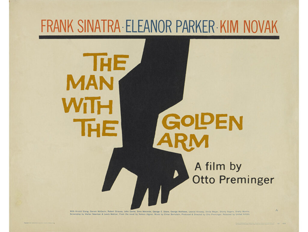
Saul Bass was one of the great figures of twentieth century design and filmmaking. Born in the Bronx, he enjoyed a sixty-year professional career (1936–96), producing a body of work that is as diverse as it is powerful. In the mid-1950s he expanded the boundaries of graphic design to include film title sequences, a genre that he transformed. He is perhaps best known for a series of title sequences, posters, and symbols, featuring impossibly compressed and highly evocative images of intense clarity and subtle ambiguities, created for films such as Otto Preminger’s The Man with the Golden Arm (1955) and Anatomy of a Murder (1959) and Alfred Hitchcock’s Vertigo (1958). Circulated worldwide, they provided some of the most compelling images of American post-war visual culture.
Thereafter, in collaboration with his wife Elaine, he continued to create stunning openings for a wide range of films, from Spartacus (1960, Stanley Kubrick and Anthony Mann) to Casino (1995, Martin Scorsese). If there were an Academy Award for such work, he, and they, would be record holders. Less well known is the impressive series of short films created by Saul and Elaine, including the Oscar-winning Why Man Creates (1968) and two Oscar-nominated films, Notes on the Popular Arts (1977) and The Solar Film (1981). Saul also served as visual consultant on five feature films (Spartacus, 1960; Psycho, 1960; West Side Story, 1961; Grand Prix, 1966; Not With My Wife You Don’t, 1966), creating sequences within the films, including the now famous shower scene from Psycho, as well as the titles, and went on to direct the now cult eco-parable-cum-sci-fi feature film, Phase IV (1974).
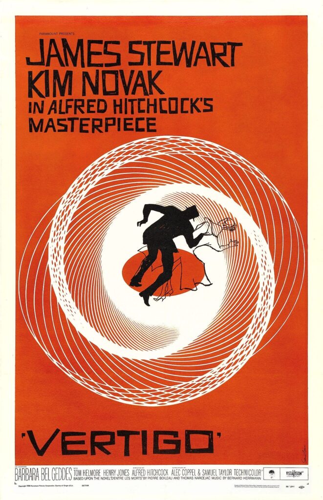
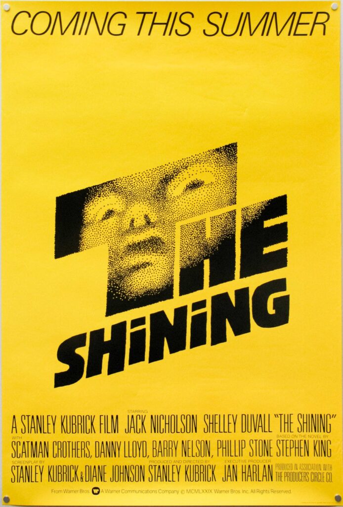
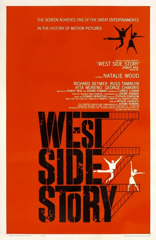
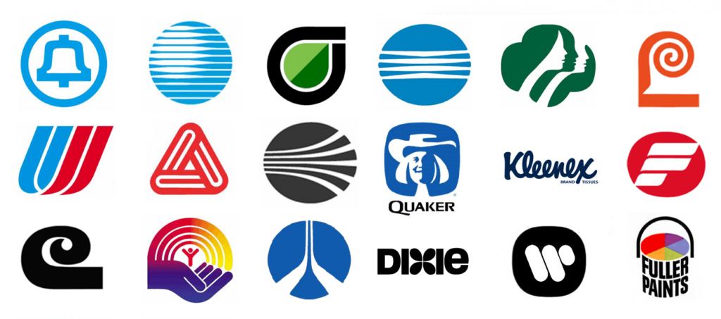
He established his own design office in Los Angeles in 1952 in order to work across a broad range of graphics and later became known as a leading designer of trade symbols and corporate identity programs. Many of the logos and identity programs he created are still in use. When writing about him one day, I realized that many of the things around me bore his symbols: my cheque book (Wells Fargo Bank), camera (Minolta), telephone bill (AT&T), airline ticket (United Airlines), breakfast cereal (Quaker Oats), cheese (Real California Cheese), spices (Lawry’s), temporary office (The Getty Research Institute), the video I had just rented (Warner Brothers) and an old paperback of The Shining. The enormous circulation of these logos, together with repeated television and video screenings of ‘old movies’ and the constant re-working of all manner of ‘Bass’ images, ensures that Saul’s work, including that undertaken in collaboration with Elaine, continues to impact and influence us.
Saul also created commercials, show openers and sponsor tags for television and designed a wide range of advertisements and packaging, as well as album and book covers, ceramic tiles, toys, exhibitions, a modular hi-fi cabinet system, postage stamp and, in collaboration with others, service stations, playgrounds, a proposed pavilion for the 1964 World’s Fair, and an installation at the XIV Milan Triennial (1968). His versatility and problem-solving approach to design were often remarked upon. American Artist attributed the ‘underlying logic’ of his work to a ‘searching mind…always inquiring into the reason for things.’ He also had a searching eye. It was an eye that saw with great clarity: Martin Scorsese likened it to a jeweller’s eye – patient and precise.
