Rudolph de Harak
1989 ADC Hall of Fame Inductee
Design, Illustration, Education, Typography, Advertising, Photography
Rudolph de Harak, born in 1924 in California, is a self-taught designer known for his influential work in graphic and exhibition design. His career began post-WWII, leading to notable projects like the Egyptian Wing at the Met and a large digital clock in Manhattan, showcasing his commitment to visual communication.
Career
Located in an old, converted Greenwich Village loft, Rudolph de Harak’s studio is bright, airy and very spacious. What hits you immediately as you step in is that everything is white and uncluttered. Much like a blank sheet of paper on de Harak’s desk, it is pristine and prepared to leap into the realm of creativity with one well-thought-out stroke of his pen.
A native of Culver City, California, Rudolph de Harak was born in 1924. His civilian life was abruptly halted by Uncle Sam’s requesting his presence in the army infantry during World War II. On returning to Los Angeles after his tour of duty, de Harak was uncertain as to what he wanted to do, knowing only that he was suited to carry “nothing heavier than a pencil!”
An inquisitive counselor at an employment agency asked de Harak what his interests were. Focusing in on his love of painting and drawing, the woman suggested that de Harak apprentice at a Los Angeles art studio that catered to local advertising agencies. It was there, in the bullpen, that Rudolph de Harak became fascinated with design.
One of his first assignments was an illustration for the Los Angeles Coat & Suit Manufacturing Association. Unbeknownst to de Harak, the ad was entered into the LA Art Directors Club competition, eventually winning an award. When told, de Harak couldn’t believe he could receive acclaim for something he made a living doing! His career as a self-taught designer was born.
While still in Los Angeles, Rudolph de Harak had the good fortune to attend a series of lectures at the Art Center School by future Art Directors Club Hall of FamersGyrgy KepesandWill Burtin. According to de Harak, both forever changed his life and became his greatest influences. It was their design discourses that opened up an entirely new vista of visual communication for Rudolph de Harak.
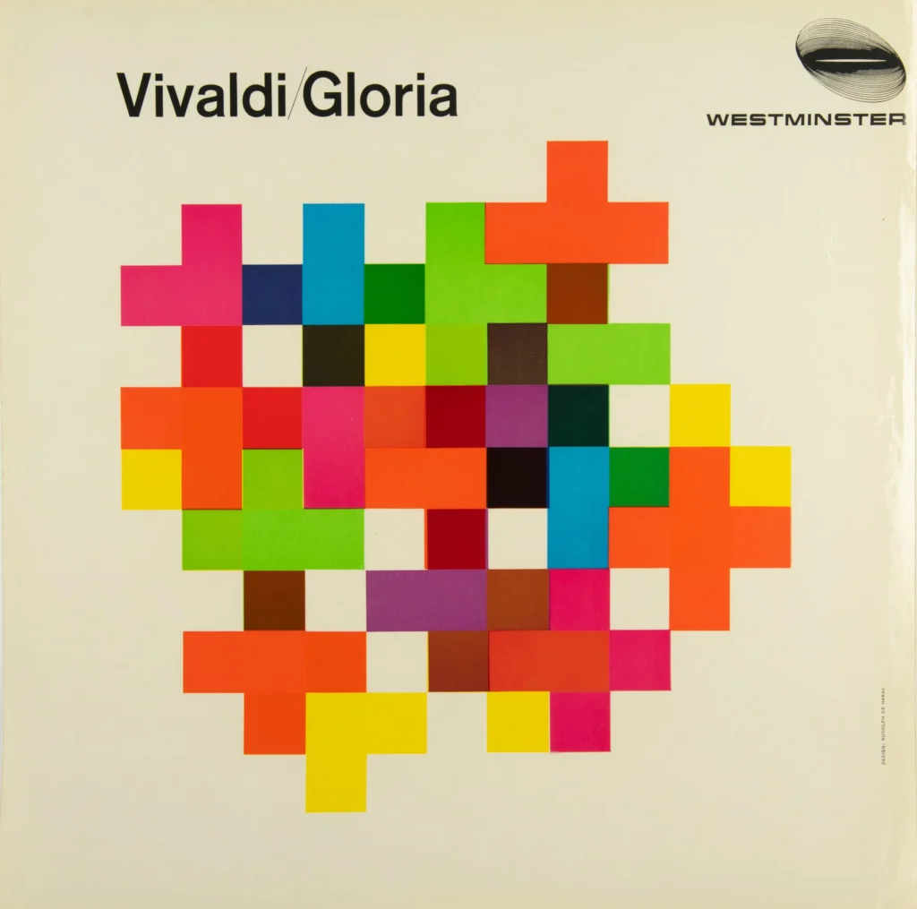
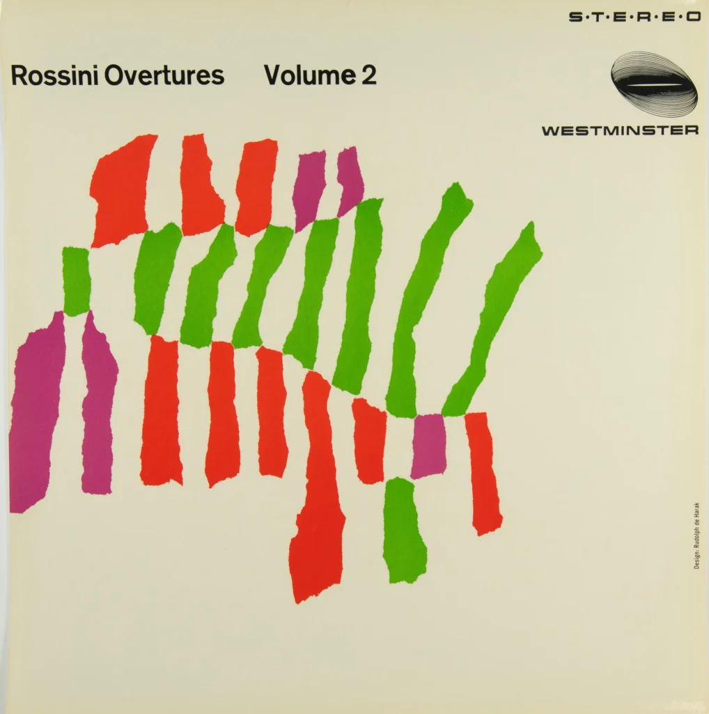
Inspired, de Harak was primed and ready to set out on his own, concentrating heavily on photography, reading, writing, researching, painting and drawing. He eventually wound up in New York City in 1950. At the age of 26, Rudolph de Harak landed a job as promotion art director atSeventeenmagazine. He learned and applied his craft atSeventeenfor a year-and-a-half before opening up his own studio. De Harak’s earliest work was a series of delightful editorial collages forEsquiremagazine.
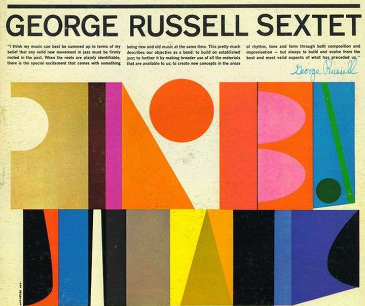
During the 1950s, New York’s visual community took design a lot less seriously, failing to recognize its legitimacy as a “true” profession. It was just this type of mentality, or lack of it, that made Rudolph de Harak work even harder to quell and dispel the critics. In order to inject some much needed credibility to his profession and establish his reputation, de Harak began taking on more interesting and problematic assignments, from record albums for Columbia and Westminster to corporate identity programs to book and pharmaceutical design work.
Although initially indirectly involved in advertising, de Harak made it a point to steer clear of hard sell, stating that he was never a good advertising salesman. He chose instead to remain on the periphery, creating wonderful informational graphics that kept clients coming back.
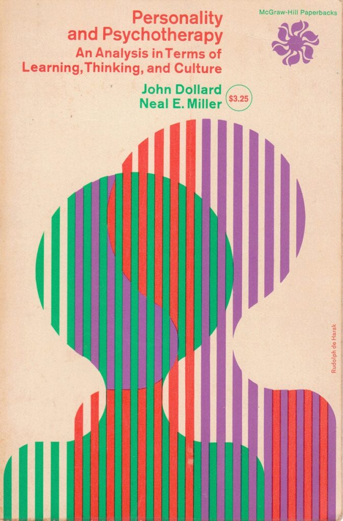
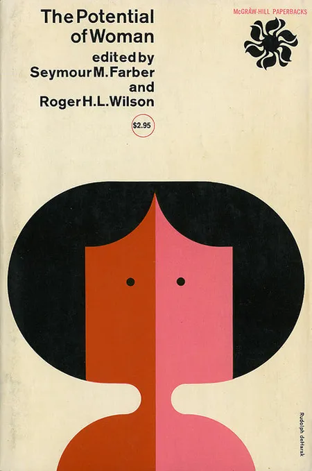
It’s only fitting that the experimental and turbulent decade of the 1960s was probably Rudolph de Harak’s most prolific and influential period. It began with an assignment to create a logo for McGraw-Hill books. Its successful completion led de Harak to design approximately 400 book jackets for them in a span of three years, an incredible output of visual imagery. In retrospect, according to de Harak, his book jacket designs were a direct outgrowth and natural progression of his record album work in the late 1950s.
While various cultural and world upheavals took place, Rudolph de Harak was quietly revolutionizing design in his own spirited and cerebral way. For any designer, there is a very special and direct correlation between time and space. It was therefore only fitting for de Harak to experiment with clock designs. Three he created in 1963 are now lodged in the permanent collection of New York’s Museum of Modern Art.
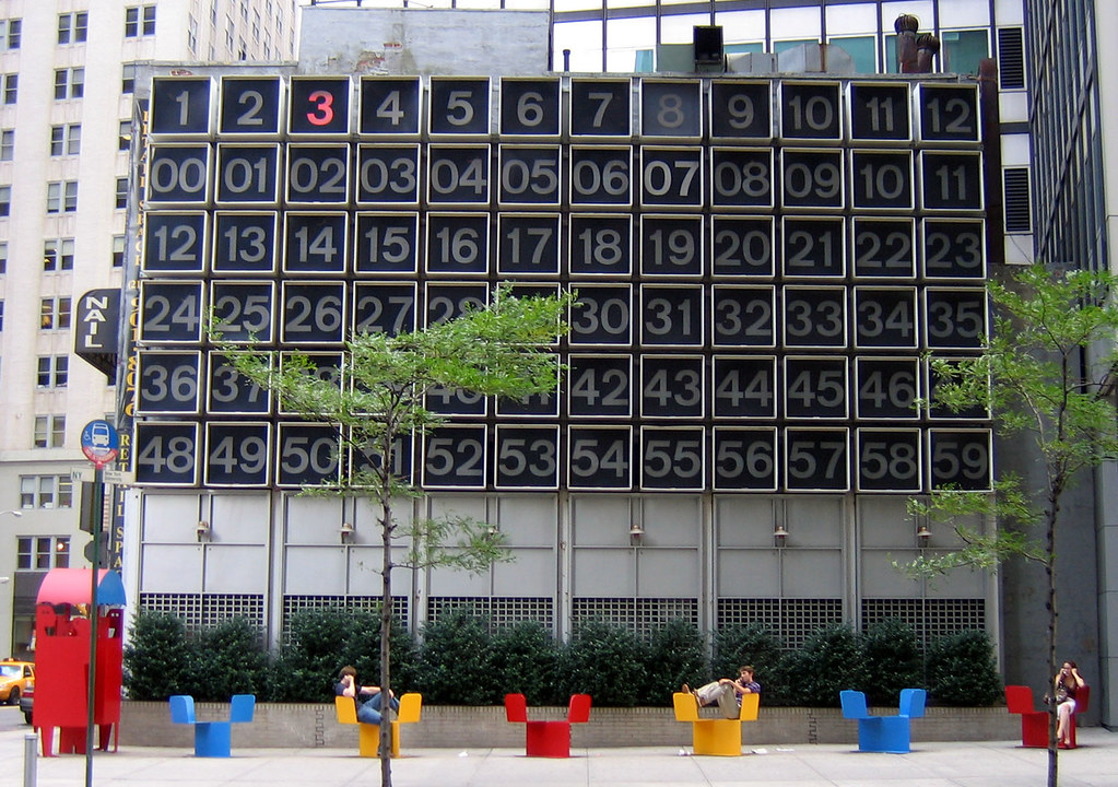
The most famous and certainly most celebrated of his clocks is part of lower Manhattan’s 127 John Street. During 1969, the building’s owner commissioned Rudolph de Harak to do all of the graphic design for the street level of the building. This included the necessity to fill a dreary 40 x 70 foot wall adjacent to the facade. De Harak constructed what is probably the world’s largest digital clock! To this day, it remains a functioning and curious sightseeing attraction to countless tourists and even jaded workers in the heavily populated Wall Street area. When viewing this clock today, one takes a nostalgic trip back to a time when pop culture so typified the tumultuous decade in which it was produced.
Another area that Rudolph de Harak immensely enjoys began rather innocently in 1965 when a friend, who taught at Ontario’s University of Waterloo, asked him to add his design acumen to the “Man-His Planet & Space” theme pavilion for Montreal’s EXPO ’67. De Harak met the task masterfully, taking two years to complete before its much heralded debut.
Riding high on the heels of EXPO ’67’s success, the United States government, based upon the results of a competition, awarded the design of the US Pavilion for Osaka’s EXPO ’70 to the team of de Harak, future ADC Hall of FamerIvan Chermayeff, his partner,Tom Geismarand architects Davis & Brody. In creating such exhibits, Rudolph de Harak approaches them as he does every other assignment: with extensive research and no preconceived assumptions on how they should look. Flexibility and calculated spontaneity, however, are still necessary variables that indeed flourish under his analytical methodology.
Very rarely have Rudolph de Harak’s standards been compromised. As an educator, beginning at New York’s Cooper Union in 1952, he has consistently put forth such notions of personal and ethical design ideology to his classes. A former student and fellow ADC Hall of FamerRoy Gracereminisced about de Harak’s “Advertising Design” class at Cooper:
Rudy brought a sense of value, elegance and eloquence into his classes none of us had ever seen before. He taught us how important priorities, goals and vision were and to fight for what you thought was right. He also said, “If you’re in this business for the money, get out! If you love what you’re doing, the money will come. Another one of my inspirations told me the same thing years laterBill Bernbach.
Such accolades earned Rudolph de Harak various other teaching and lecturing positions, including Carnegie-Melon and Yale University. In 1979, for recognition of his teaching, The Cooper Union made him their Frank Stanton Professor of Design Emeritus.
Rudolph de Harak’s extensive knowledge of typography led him to create many wonderful examples of signage throughout his career. His playful, spirographic images and polymorphous geometric shapes are all hand-executed and grace many corporate identity programs and logos. Witness his work for the Kurt Versen Lighting Company in 1959 and the United Nations Plaza Hotel in 1975. Both are timeless examples of creative visual simplicity. Another shining example is de Harak’s shopping bag design for the Metropolitan Museum of Art in New York. The perfect blending of the classic Caslon-540 type style with the modern touch of wraparound imagery on bright, primary colors, it became an instant success and status symbol when it first made its appearance in 1978.
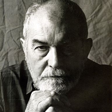
When asked the typical “loaded” question: “What were your most glowing achievements as a designer?” De Harak, the grey-bearded philosopher of design pondered for a moment, tugged at his chin and thoughtfully responded, “It would be like picking out a favorite child; it simply can’t be done. I love them all. Each is very special in its own way.” Further pressed, de Harak did mention two projects that still bring him great joy. First is the Metropolitan Museum of Art’s Egyptian Wing and second, the Cummins Engine Company Corporate Museum.
Exhibition design is quite a challenging undertaking. The viewer should always be conscious of the content and not overtly conscious of the design holding the content. With this in mind, master architect of the Met Kevin Roche invited Rudolph de Harak to work on the Egyptian Wing. It was a project requiring extreme discipline, terrific intensity and continuity. De Harak explains:
What was decided in 1974 at the onset of this project had to have the same sense of ambience and consistency to last through to its completion. One could not simply change styles and concepts midstream, thereby sacrificing the overall look of the Wing. This took a great deal of restraint sticking with the original design.
The project took 12 painstaking years to complete with very little, if anything, left to chance. When one walks through it, its splendor and all-important cohesiveness is omnipresent. An outgrowth of the permanent exhibit was to take de Harak’s exhaustive Egyptian color transparency time line and put it into a highly successful book form.
The Cummins Engine Company assignment presented itself with an entirely different set of design variables. Based in the small city of Columbus, Indiana (population about 25,000), Cummins is a long-thriving manufacturer of diesel engines. ADC Hall of FamerPaul Randis a design consultant to them as are various other top designers. When it came to creating a corporate museum, Cummins commissioned Rudolph de Harak. Because of the client’s full cooperation and total commitment to the designer, de Harak leapt at the opportunity.
After extensive research and talking with workers and engineers, de Harak had his “master” plan for the Cummins Museum. His centerpiece was to be a huge diesel engine “exploded” and displaying over 1,000 partsall separated on a logical basissuspended in midair with fine stainless steel cables! This, no doubt, was the piece de resistance of the Museum and a feat that both the Cummins Company and de Harak remain extremely proud of.
As the 1980s draw to a close, Rudolph de Harak is a partner in De Harak & Poulin Associates Inc., an internationally recognized graphic and exhibition design firm. He now has more time to devote to painting, black & white photography, and enjoying the house he had built in Maine with his wife Carol.
Borrowing the apropos and venerable latin phrase, “tempus fugit,” time flies, especially when you’re having fun! For Rudolph de Harak, this is what the inherent challenge of visual communication is all about. His personal design statements and interpretations, not to mention his strong responsibility to aesthetic values, make him, truly, the designer’s designer.
Photo credit: Carol de Harak
