Paul Rand
1972 ADC Hall of Fame Inductee
Design, Advertising, Typography, Education, Illustration
Paul Rand, a pioneering designer, revolutionized visual communication through innovative editorial and advertising work. His early covers for magazines showcased his unique style, blending fine arts with graphic design. Rand's contributions to corporate identity and typography established him as a key figure in modern design, enriching visual language significantly.
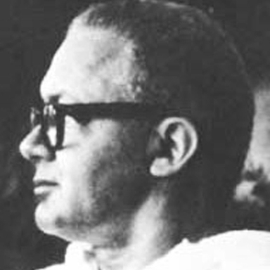
Career
The human animal discovered soon after it was perched up high on the evolutionary ladder that languishing on the “grunt and point” rung of communications was hardly a suitable posture for a sapient species. Eventually, a rather involved way of saying what had to be said was devised. At various stages of his advancing sophistication, it seemed as if man was about to be garroted by the complex strands of his invention. By inherent good fortune, however, language written or spoken developed a built-in system of popular reform. Once language begins to drag behind or move out of step with the man’s myriad activities, it has to catch up or suffer the perils of decay. Unfortunately, visual language doesn’t enjoy the same kind of continuous parental attention. The task of nourishing our visual rhetoric and communication falls to artists and designers who, by personal afflatus, are impelled to take on an imaginative guardianship.
History has been sufficiently beneficent to produce designers who could meet the existing challenges with appropriately imaginative solutions. Occasionally, history outdoes itself and produces a designer who imparts such startlingly new concepts to our visual language that the beneficiaries of the following decades are blessed with a wealth of visual idioms.
In 1937, two leading national magazines put their art directorial trust in the hands of a young designer only twenty-three years old. The designer was Paul Rand, a former student at Pratt Institute and Parson’s School of Design, who had also studied with George Grosz, the celebrated figure of German Expressionism. Rand continued his ministrations atEsquireandApparel Artsfor four years. Any suspicion that Rand’s art directorship might be a meteoric streak of bright precocity was abruptly put to rest by a number of astonishing covers he created forApparel Artsand particularly for a small magazine calledDirection. Early brightness was quickly recognized as the harbinger of genuine brilliance. Rand’s subsequent work further established him as a mature designer of first rank and as an articulate theorist whose ideas would radically affect the shape and contour of contemporary visual design.
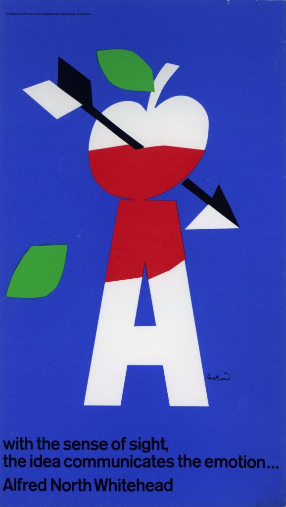
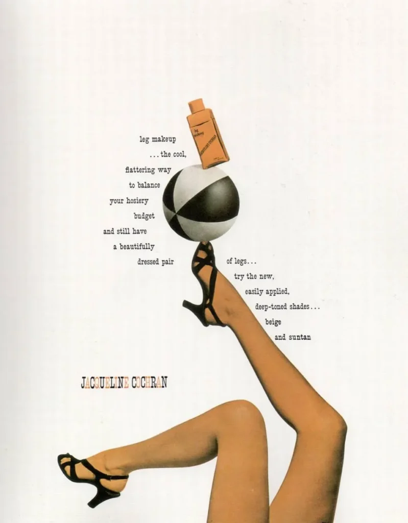
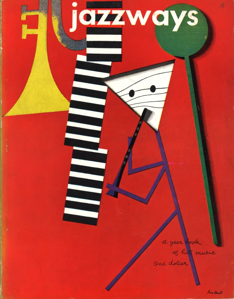
Rand’sApparel Artscovers of the early forties were primarily collages employing quasi-Dadaist ideas and techniques. By utilizing a commonplace object to have more than its conventional meaning, Rand actually antedated the satire of theobjet trouvart movement that arose at least two decades later. His most coherent project was the series of covers he produced forDirection. Appearing over a period of several years, these covers had a collective impact that was revolutionary. Each individual cover was a radically inventive departure from the prevailing editorial dross. By drawing upon the creative discoveries of a host of modern art movements, Rand linked the fine arts with popular graphic application. The imagination, vitality and quality of those covers have probably not been equaled by any editorial designer of recent times. Many of them have become classics. The memorable 1940 cover showing a photograph of a barbed-wire cross ranged against the casually written tag summed up with extraordinary poignancy the contradictory aspects of man’s behavior to man. That interplay of ideas and his abstract use of large letterforms opened new modes of visual symbolism for all modern designers. Rand showed that even the simplest of objects, given different contexts, bears within it several thicknesses of meaning. It takes the magic of the designer to seize the concealed and make it apparent, and to transform the commonplace into the rare. By illuminating the potential of the graphic symbol, Rand presented contemporary design with one of its most functional aesthetic donations.
Rand eventually left the introspective fields of editorial design to take up the more combative challenges of advertising. For thirteen years, until 1954, he was the art director (now called creative director) for the William Weintraub Agency. Responding to that milieu with its new demands, Rand steadily broadened the scope of his work. Filmmaking for television was yet to be the focal advertising medium it is today. The printed page and the graphic problems of poster, book, promotional and package designs demanded Rand’s total attention. He also taught intermittently at Pratt Institute and Cooper Union. In 1946 Rand compiled a statement of his personal observations and philosophy, which was published in a handsome book designed by him and titled “Thoughts on Design.” It remains a lucid exposition of the anatomy of his thought, paralleling the clarity and directness of his work.
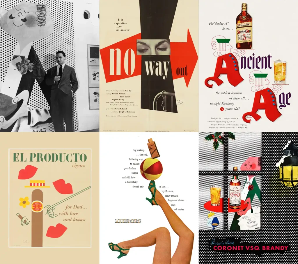
Rand’s originality was as evident in advertising as it had been in his earlier editorial output. His approach was a remote cry from the bold word plays and simplistically designed advertising pages that abound today. Yet, oddly enough, the use of multiple meanings of one symbol, as well as the spirit of iconoclastic wit in today’s advertising, bear considerable debt to the work of Paul Rand. Rand approached advertising much like an artist. Virtually every ad bore his personal stamp. If we can borrow a term from a group of contemporary filmmakers, Rand was an “auteur” art director. Rand searched out the potential graphic wealth that lay in the selling message itself, employing a host of visual devices to captivate the reader. And that they did. The playfulness and witty charm of the Ohrbach’s campaign cleared away the thickets of convention that had suffocated contemporary advertising. Particularly in that series, his ability to grasp the familiar object and convert it into a charming yet commanding symbol was at a peak. Each campaign represented a personal visual journey that called for daring and imagination to set it apart from the surrounding banality. The Disney hat ads were exquisitely designed abstractions that kept the reader endlessly fascinated by the counterpoint between an antique Brummel figure and an up-to-the-minute chapeau. Each campaign was invested with a special kind of graphic humor. The hallmarks of his style were the studied casualness of the Rand script, a light and unselfconscious typography always accompanied with a refined sense of space. The campaigns are legion: Dubonnet, with its revival ofCassandre‘s imperishable man, the Coronet series with Rand’s anthropomorphic brandy snifter, the kinetic abandon of the El Producto cigar boxes and ads, and the graphic legerdemain of the Kaiser-Frazer series.
 

Rand, a scholarly and sensitive typographer, found the most satisfying outlet for that gift in the numerous books he designed for sympathetic commercial publishersspecial patrons who recognized Rand’s exceptional typographic genius.
In 1954 Rand ended the agency phase of his career. By this time, his abilities had become universally recognized. A larger aesthetic canvas was neededone that would give continuity and dimension to the full scope of his concepts. This could only be realized by his functioning as an independent designer. Rand became the design consultant to numerous large and influential companiesIBM, Westinghouse, and United Parcel Service, among others. He brought these companies into a position of graphic esteem, establishing for them corporate design programs of human proportion. Corporate communication, he has shown, can be socially enriching if it is intelligently conceived and imaginatively executed. Because of his exquisite sense of visual symbolism, Rand is continually called upon to design trademarks for a host of business enterprises, many of which have become renowned. Apart from his very active and far-flung design practice, he has continued his interest in education, occasionally teaching and lecturing. As a steady and perceptive writer on design, he continues to expand his list of articles.
Early in Rand’s career,E. McKnight Kauffer, acclaimed poster artist, said of Rand in the introduction to “Thoughts on Design”: “These ‘reflections’ reveal a thought, and by the examples of his work, a practice that is a composite pattern. He does not say one thing and do another nor do one thing and say anotherhis conceptions (theory) guide his feelings, and in turn his feelings (sensibility) humanize his conceptions.
Because Rand has kept and nourished the faith, we are that much richer. Design can communicate that much more because of his additions to our visual language. History, it was observed earlier, manages to provide us with benefactions and Paul Rand is one of those special gifts to our time.
Please note: Content of biography is presented here as it was published in 1972.
