Lucian Bernhard
1981 ADC Hall of Fame Inductee
Design, Typography, Illustration, Advertising, Education
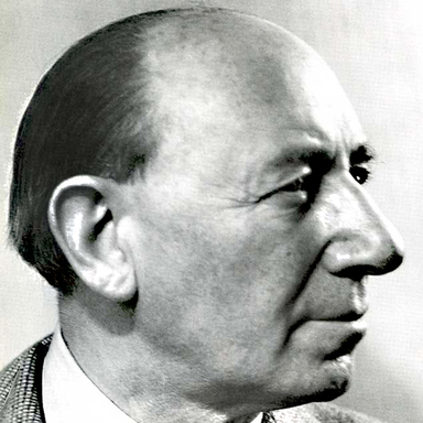
Lucian Bernhard, born in 1890 in Stuttgart, became a pivotal figure in modern graphic art. His early fascination with signs led to a groundbreaking career in poster design. He influenced typography and interior design, creating notable works in the U.S. and Europe, and developed a phonetic alphabet for English.
Career
It was the time when Ulysses S. Grant was President of the United States. It was the time when the great powers of Europe were dividing Africa into colonial states. And it was a time when a small boy in Stuttgart, Germany, developed a pastime that was to affect the world of graphic art during the century ahead.
The year was 1890 and Lucian Bernhard was seven years old. Too young to read, he was nonetheless fascinated by the street signs and shop signs that defined and decorated his neighborhood. With paintbrush and ink bottle he meticulously copied the words. Eclectically then, he selected many of the Gothic characters and composed letters to friends and members of his family. To him these were beautiful compositions and he was greatly disappointed when he learned that no one could read them.
Ten years later, the adolescent Bernhard managed to get a ticket to the historic Glaspalast Exhibition of Interior Decorations in Munich. In his own words, he “just walked around drunk with color.” So impressed was he that he went home, during the family’s weekend absence, and, in his characteristic fashion, went to work painting the entire house, furniture included, in the bright and glowing colors of the Glaspalast Exhibition. Again, he was greatly disappointed to discover that no one else in his family appreciated the results of his labors. In fact, the argument with his father was so bitter that Lucian left home and never returned. He was obviously a young man with strong convictions.
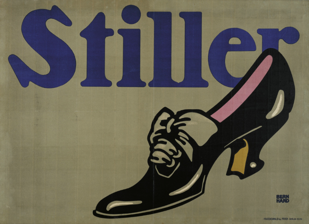
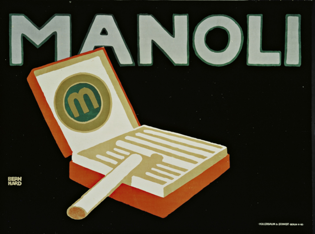
Bernhard took his convictions to Berlin. In Paris, Renoir and Toulouse-Lautrec were at work. It was Picasso’s Blue period. Edvard Munch was painting “Girls on the Bridge” and Max Klinger was sculpting “Nietzsche.” Seventeen-year-old Lucian Bernhard was trying to write poetry for little magazines and, for him, it was a depressing period. With nothing to lose, he entered a poster contest for the Priester Match Company and his simple, colorful entry won first prize. Lucian’s design signaled the beginning of modern commercial poster art and his career was launched. During the next two decades, he became known throughout Germany and Europe as a designer of posters, of furniture and interiors, of lettering, type and package design. In 1910 the Berthold Foundry brought out a new type face in “block” letters based on Bernhard’s poster lettering, which displayed a remarkable anticipation of the “Sans Serif” lettering of the 1920’s. The Flinsch Type Foundry followed with the production of Bernrnhard “Antiqua,” “Kursiv,” “Fraktur,” and half a dozen others.
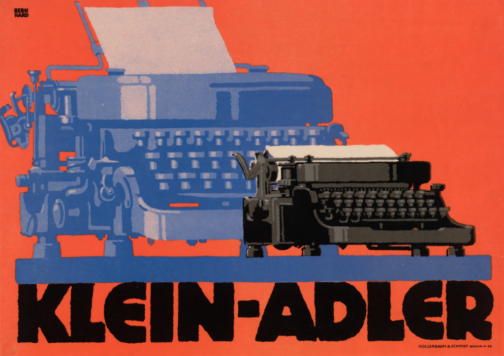
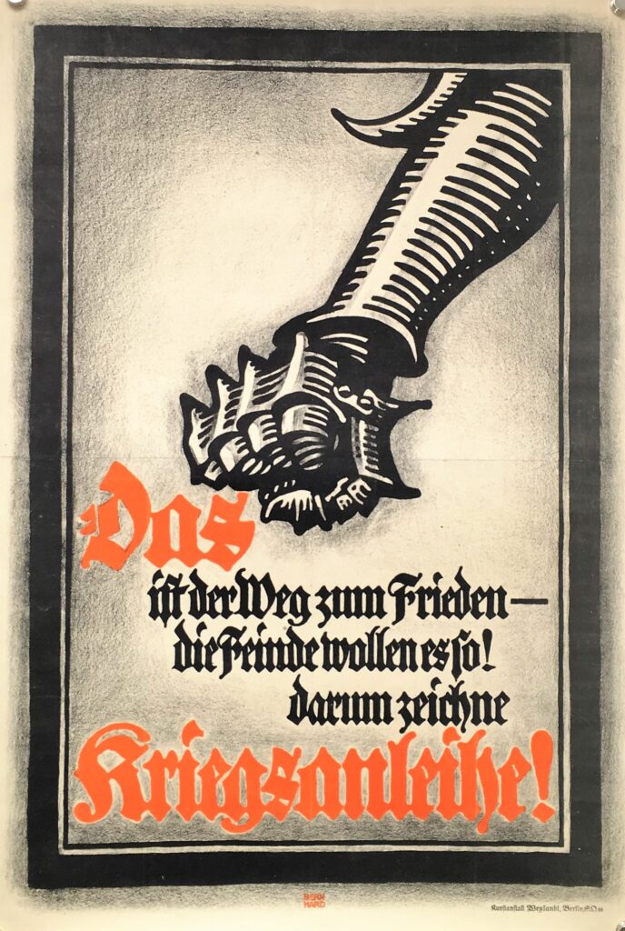
The start of World War I marked a deep change in his life. After a period as an army corporal, the government finally decided that his artistic talents were more valuable than his military skills and set him to turning out posters in support of the war effort. By war’s end, both the world and Bernhard had changed. The boldness of his earlier work had given way to the more sophisticated delicacy of the mature artist. The “Schonschrift,” his famous script letter of 1922, designed for Bauer Type Foundry, is the first testimony of his change of heart.
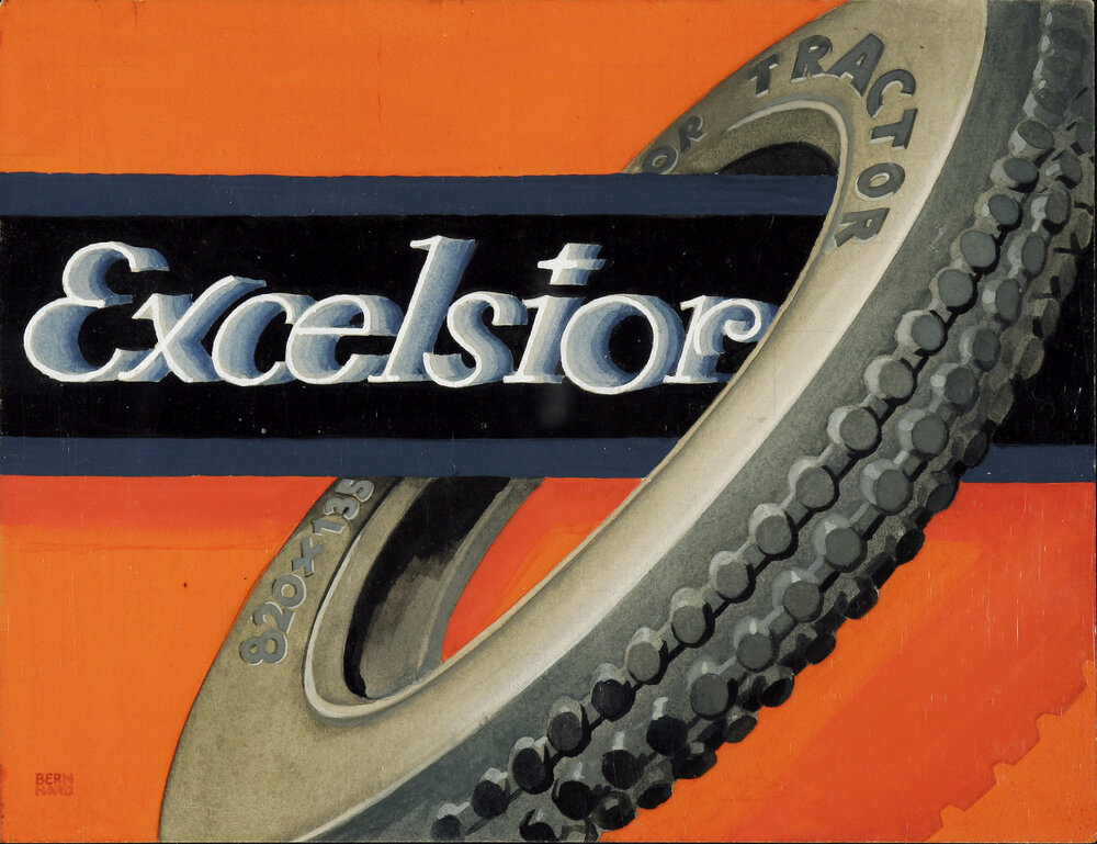
As an adult, Lucian continued to display the single-mindedness of the boy and the youth. When he became a member of the Deutsche Werkstatten to learn furniture design, he discovered that to achieve the best, the designer would have to start with the room where the furniture would be, then, logically, with the house where the room would be containing the furniture. This led to his interest in architecture. Eventually, he was designing not only furniture, but also homes, factories and office buildings, inside and out. He was also designing wallpaper, fabrics, hardware, rugs, lighting fixtures, and stage sets. His creative spirit knew no bounds. Early in the century he had become one of the founders ofDas Plakat, the famous German magazine of poster art, predecessor of the internationally famousGebrauchsgraphik. Through this medium his name became known in America and in 1923 he came to the United States on the invitation of Roy Latham, a New York poster lithographer, to execute several commissions. This experience led to Bernhard’s decision to settle here permanently, while maintaining his large Berlin studio. During these first years he worked mainly as an interior designer, doing rooms for Random House, the Modern Library, and several private luxury apartments and homes. These early years were not easy ones for a man who had run a thirty-man studio in Germany and who now had to deal with American art directors, who found his concepts too revolutionary or too modern for contemporary American tastes. His big break came when Rem Pharmaceutical Co. gave him his first important campaign long before New York had become fully aware of modern poster design’s genesis in Europe. With his “Three Men in the Snow” poster for Rem, Lucian Bernhard was off and running, designing everything from matchbooks to delivery trucks to mausoleums, pianos for Hardman, chairs for Grand Rapids, the Ex-Lax factory in Brooklyn, more packages and posters for Rem, Ex-Lax, White Flash Gasoline, Amoco and scores of other leading American corporations.
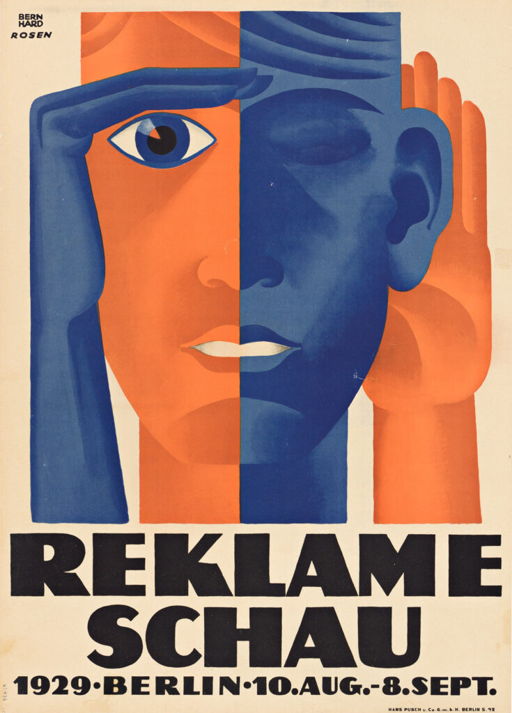
In 1928, the prolific Bernhard signed a contract with American Type Founders and proceeded during the following decade to produce for them Bernhard “Gothic,” in light, medium, heavy, extra heavy and italics, Bernhard “Fashion, Bernhard “Modern” with italics, and “Tango” script. Shortly before the depression, he founded the furniture and interior designing firm “Contempora,” with Rockwell Kent in New York, Paul Poiret in Paris and Bruno Paul in Germany. At a luncheon three decades ago, Bernhard gave an address dealing with the future of type design. In answer to a question from a member of the audience, he assured and heartened everyone with the observation: “Yes, I am already at work on the type of the future.” As he recalled it, not until he got home that night did he really turn his mind to what the type of the future would be. After six years of thoughtful, meticulous work he produced the system called “Fonotype,” a basic design for a spelling system he believed would be practical in expediting the teaching and reading of our language, as well as in facilitating the acceptance of English as a world language. This phonetic alphabet made English a language that could be spoken as it is spelled, or spelled as it sounds. In a Bernhard retrospective held at “The Composing Room” in 1962, thePrinting Newsedition of Bernhard’s “Instant Spelling” was the centerpiece display. In the mid-1930’s, Lucian Bernhard turned to painting and sculpting. In these pastimes he disregarded the restrictions of poster work and applied design. In his posters, for instance, he used only primary colors. In his painting he shunned primaries and instead displayed his sense of color with all the subtle tints and shades, yet all the gaiety and vibrancy of the life in the real world around him. As Percy Seitlin wrote inPMMagazine: Lucian Bernhard has done more than anyone else to introduce to America something of the fresh and flourishing spirit of post-World War I European art. Color was the keystone of this art, and directness, simplicity and gaiety were some of its important characteristics.”
