Jan Tschichold
1979 ADC Hall of Fame Inductee
Typography, Design, Education, Illustration, Advertising
Jan Tschichold, a pivotal figure in typography, transformed design with his modernist principles after being inspired by the Bauhaus in 1923. He faced persecution under the Nazis, later moved to Switzerland, and contributed significantly to book design, including creating the Sabon typeface. Tschichold died in 1974.
Career
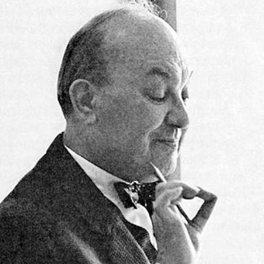
Born in Leipzig, the son of a designer and painter of letters, Jan Tschichold was exposed early in childhood to the craft that became his life’s work. This first exposure to type notwithstanding, Tschichold studied to become an artist and took evening classes in calligraphy.
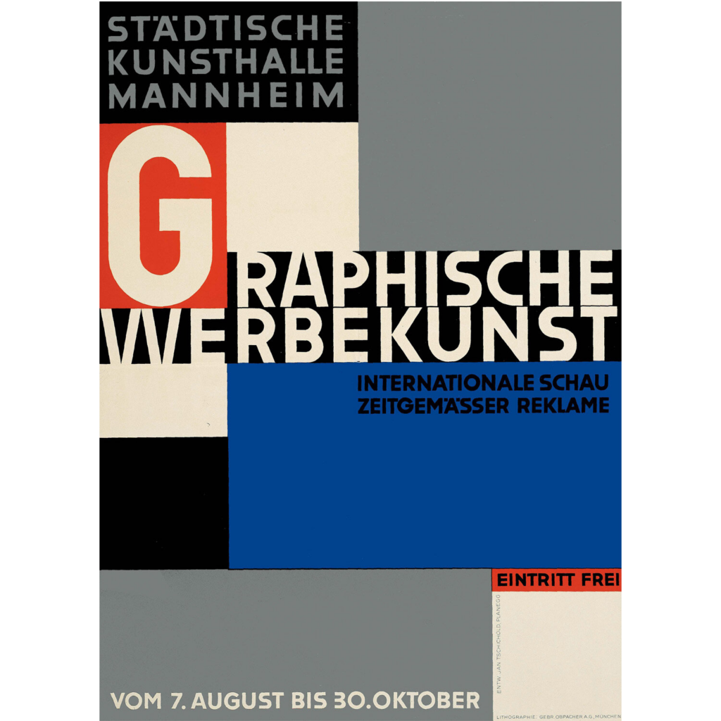
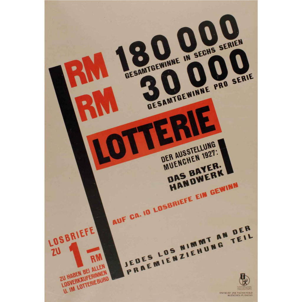
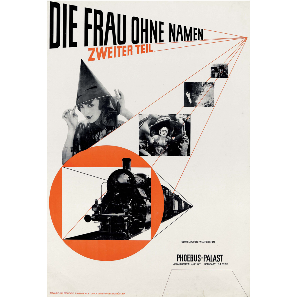
In 1923, when he was twenty-one years old, he visited the Bauhaus Exhibition in Weimar, and was astonished by what he saw. It is said that he left Weimar “a changed man. Just two years later, he had formulated a set of typographic principles, which he published in pamphlet form under the titleElementaire Typographie. In 1928, Tschichold publishedDie Neue Typographie, a full treatment of his new ideas for typographic design. It is the first manual of typography for designers, as opposed to typography for printers.
The book was set in a sans-serif typeface and designed in Tschichold’s new style. With its publication, Tschichold formalized his assault on the ugly and cluttered typography of postwar Europe, a campaign that gave him the reputation of a modernist who rejected everything classical.
The Nazis disliked Tschichold’s asymmetrical designs; they were not orderly enough for that military society. His recalcitrance and hostility to the regime led to his dismissal from his post as lecturer in typography at the Meisterschule fur Deutschlands Buchdrucker in Munich, and in 1933, he and his wife Edith were imprisoned as members of an intellectual minority. After six weeks, they were released and immediately left Germany with their child to live and work in Switzerland.
By this time, Tschichold had expanded his beliefs about typography and was designing books along more classic lines. He was bitterly attacked for this by former disciples who had accepted without question his assertion that only sans-serif type and asymmetrical typography were permissible in modern printing. The extreme reaction to this intemperate expression of a young radical tended to obscure the fact that the book in which the statement was made was the first set of rules for typographic design, which were valid whatever the style of the designer.
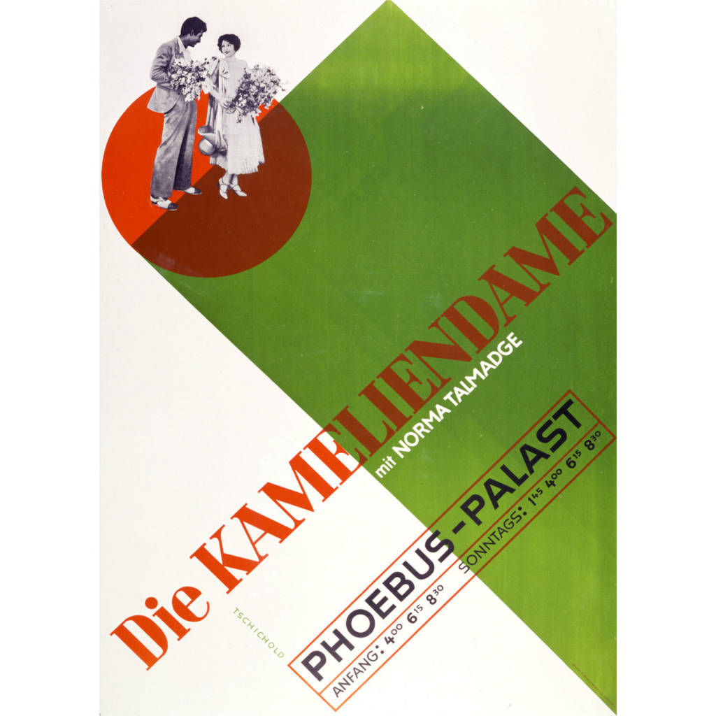
In 1935, Tschichold was invited to England by Lund Humphries, the printing firm, to view their exhibition of his work. While there, he was commissioned to redesign the firm’s letterhead, and to design the 1938 Volume No. 40 of The Penrose Annual, which Lund Humphries then published.
By 1945, Tschichold had gained fame in the typographic world for the books he designed, as well as those he wrote, altogether an impressive list. His beautiful work and impeccable craftsmanship made him the logical choice when Allen Lane wanted somebody to develop an orderly system of design for his Penguin Books.
Tschichold combined a series of grids with a set of rules of composition and forced their acceptance by a reluctant, sometimes rebellious, printing craft. His perseverance served to inspire tremendous improvement in the quality of all British books, as his techniques were admired and imitated.
Returning home, Tschichold picked up his career as book designer and typographical consultant for publishing and business. Along the way, he developed Sabon, the first typeface to be identical in appearance in Linotype, Monotype and hand composition. It is the typeface used in this article.
Tschichold’s honors include the AlGA Medal, the Gutenberg prize of Leipzig, given on its 800th birthday, an appointment as Honorary Royal Designer for Industry in England and a correspondent membership in the German Academy of the Arts.
His other interests include a collection of early writing books, calligraphy, and Chinese woodblock color printing. He was an indefatigable researcher and prodigious writer. Few of his writings have been translated into English, one of those few being, curiously enough, a pamphlet tracing the origin and development of the ampersand.
Jan Tschichold died in 1974.
