Jan Middendorp
2023 TDC Medalist
Typography, Design, Education, Illustration, Collaboration
Jan Middendorp is an author, researcher, and designer living in Berlin. He has edited and written books and articles about typography, design and the performing arts; designed printed matter for publishers and non-profit organizations; worked as a consultant and editor to the type world. He has done other things as well.
Career
I’m glad to know Jan Middendorp personally for many years (much longer than many of my peers, but shorter than many of my colleagues, of course) and lucky to call him a friend.
I can even recall my first memory of him. I was a type design and typography student at UMPRUM Academy of Art, Architecture, and Design in Prague. Together with Tomáš Brousil, we started our TYPO9010 book project and worked on developing the concept and layout. I idolized Jan from afar back then, and I thought of how he wrote and presented typefaces when coming up with the idea of a collection of Czech digitized typefaces between 1990–2010. Jan’s comprehensive, elaborate, and overall stunning publication, Dutch Type — first published in 2004 — was a Bible upon which we looked. It was an essential source of inspiration and information, and it challenged us to create a similar masterpiece for the field of typography. Jan inspired us to make our book “bolder” by writing Dutch Type. Tomáš also knew Jan very well from MyFonts and Creative Characters, a series of interviews with inspirational type designers — including Tomáš — that were later published as a book.
But, at that point, I only knew Jan from the internet, his reputation, and his works. That’s why my image of him was larger than life; I was in awe of him in the truest sense of the word. I saw him as a super famous type designer and typographer, one of the best experts in the field, who created many books, wrote thousands of articles, and is respected by anyone who ever thought of designing a type. And that’s why it took a lot of bravery (and perhaps some naivety) when I emailed Jan to ask if he could write a short introduction text for our TYPO9010 book. I thought he might like our idea, and since he knew some of the guys on our team, he might be glad to know about our project and would support it.
Out of everyone I’ve emailed with a request to write a short essay or article for our book, Jan was the only one who did not reply at all. Surely that must have meant that our project sucked! As newcomers, we stood no chance in the type design world! But I was stubborn then, and we finished the book without him.
A few years later, when Jan and I finally met in person at TypoBerlin, he was browsing our book. He liked it immensely, and told me he wished he could’ve been a part of it. He was sad about not knowing about its release. I immediately regretted thinking he ignored us on purpose back then, but I did not tell him about my attempt to reach him about the book two years earlier.
But this misunderstanding taught me a big lesson. It showed me I needed to be more active in the typography network. Knowing Jan in person would open doors, and showing and speaking more about our upcoming projects would help spread the news and maybe attract the attention of other professionals who have something to correct or comment on topics we were working on. Jan opened my eyes to see the vast network of typographers linked through their research, libraries, fonts, and scripts and willing to share and contribute. Since that TypoBerlin, I have tried not to miss a conference to talk to him and other typographers.
Two years after our first confrontation, Jan gave us a massive hand with our next school project, Bestsellers, where we were assigned to create a bestselling typeface on purpose. From our research on key features and price points, we found that Monotype’s MyFonts charts were the most straightforward and offered an optimal way to test and prove our results. Twelve of us students designed typefaces based on our research, and Jan helped us edit and upload our fonts for review and later for sale. Thanks to his help, we started twelve new foundries and could put our fonts online in a super short amount of time. We went from first sketches to the first invoices for selling our fonts in only twelve weeks.
Since then, Jan and I have met on various occasions around the globe. The AtypI conferences, TypoLabs and TypoBerlins, and small local meetings all lead to more profound type talks, sharing news about planning typography projects or collaborations. I had a chance to get to know him in the last decade when the amount of work he was doing wasn’t small at all. I can only imagine the scope of work he had on a desk over the decades when he was a full-time independent writer, translator, and consultant.
I would say that Jan is a practical “renaissance” personality. He would work on multiple long-term and short projects at the same time. He is an excellent writer and author of many theatre and dance critiques, a journalist who wrote and edited hundreds of interviews, articles, and short reviews on various cultural fields for newspapers, magazines, and monthlies, and a great friend to many well-known figures and personalities. I mainly know Jan as a graphic designer, art director, book editor, and writer who does more than just graphic design, layout, or cover design. His importance lies in the thinking of the book as a whole; he creates the first idea of the topic that was not captured and fully described yet, and he gathers the content and visual materials no matter how long it takes. Then Jan has the energy to not only write the entire text but also participate in designing the entire book concept and layout and, if necessary, initiate the creation of the font needed for typesetting. Jan also invites various creatives to join his journey to self-publish multiple books on typography.
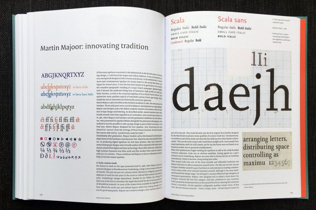
Before Jan created his milestone publication, Dutch Type, he had already prepared the soil by writing features about Dutch type designers for the design trade magazine Items. You can read about such legends, heroes, and stars as Gerard Unger, Martin Majoor, Rudy Vanderlans (Emigre), Luc(as) de Groot, Erik van Blokland, Fred Smeijers, and many more. By putting so much effort into capturing a single country’s visual legacy, Jan attached a great spotlight on them, gathering an audience for its visual aesthetic and history so it could be available and appreciated by everyone.
Other titles on Jan’s that you should also have in your personal library include ‘Ha, daar gaat er een van mij!’ [‘Hey, there goes one of mine!’], a chronological collection of graphic design in The Hague from 1945 to 2000. There is Hand to Type, every handletter’s favourite hardcover on scripts, lettering and calligraphy. Shaping Text, full of typography tips and tricks, is perfect for students, and the beautifully designed Type Navigator is a guide of independent type foundries.
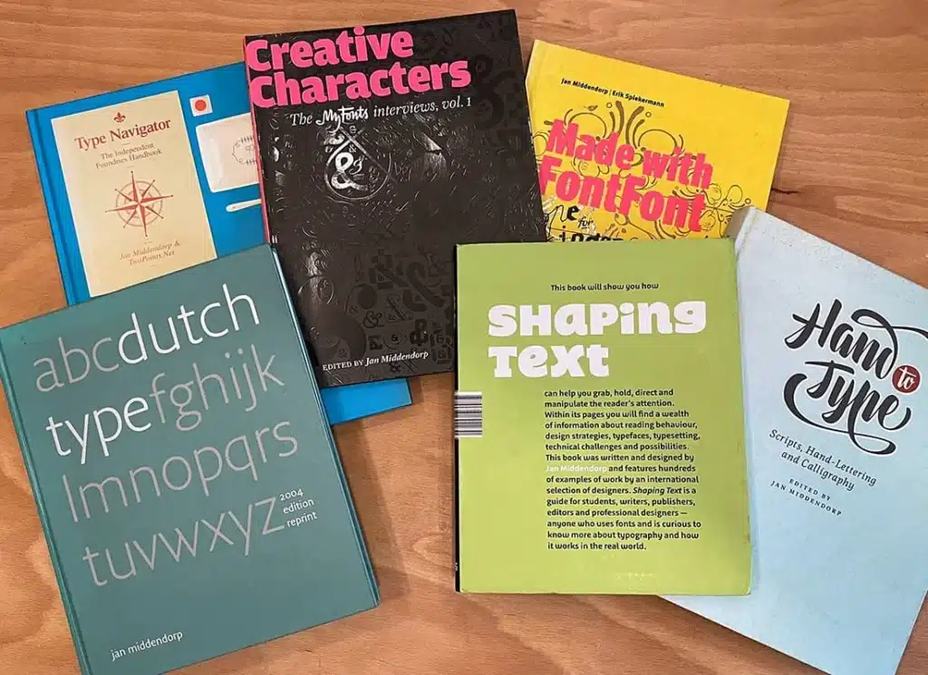
Jan’s enthusiasm for typography, his fascination for letterforms, his passion for writing, his patience, and his ability to teach and consult typography are all simply stunning. I admire him as a teacher, a speaker, and a mentor. I learned a lot from his way of talking, expressing, and writing about something he loved — the letterforms. His high appreciation of beautiful calligraphy, precisely balanced book covers, and elaborate fonts was innate. Sadly, I am too young to have personally experienced the exhibitions he curated and organized. Still, I’ve had the chance to laugh at his semi-dark Dutch-sharp British-gross German-dry jokes and listen to his inimitable DJ skills that became legendary.
Jan’s contribution to the typography world and beyond affected many type designers, readers, and designers and will continue to affect many newcomers in the future. His publications and texts are essential to every typographer’s reading list, and I could hardly imagine someone better to be awarded the TDC Medal.
Written by Petra Dočekalová. Petra Dočekalová is a Prague-based type designer, letterer, and sign painter.
